Borders, But Fancy
The CSS tricks behind fancyborders, from gradient rings and travelling beams to cut-corner shapes, and why every one of them is a layer.
Borders are the most underrated detail in UI. Corner brackets, a glow on the pricing card, a light running around a "deploying..." box: tiny things that make a page feel designed.
CSS border gets you about 10% of the way there. So I built fancyborders: 24 copy-paste frames, outlines and effects for React and Tailwind.
Here are the tricks that made it work.
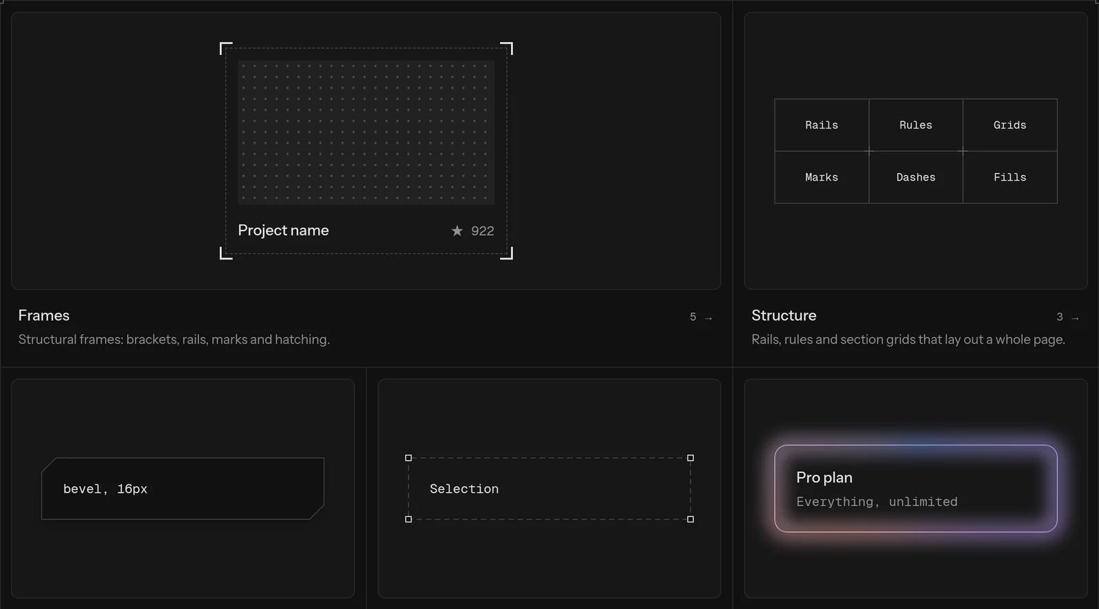
Stop fighting border, stack layers
One giant component with a prop for every effect gets messy fast.
What works: a Frame is just a positioned box, and every decoration is a layer inside it. Layers are position: absolute with pointer-events: none, so they never touch layout, and you can stack as many as you want.
<Frame radius={14} className="p-6">
  <FrameRules overshoot={10} />
  <FrameCorners mark="plus" />
  <FrameGlow />
  <FrameGradient />
  Content
</Frame>Every layer is driven by CSS custom properties, so Tailwind utilities can restyle it, hover states included:
<Frame className="frame-line-2 frame-color-sky-500/50 hover:frame-color-sky-500">Lines that overshoot are just backgrounds
Those blueprint-style lines that run past the corners can't be a border, since a border stops at the box.
Instead, the rules layer is a box that's a little bigger than the frame, painted with four 1px linear-gradient backgrounds:
.fb-rules {
  --_h: linear-gradient(var(--fb-line-color), var(--fb-line-color));

  position: absolute;
  inset: calc(var(--_oy) * -1) calc(var(--_ox) * -1);
  background:
    var(--_h) 0 var(--_oy) / 100% 1px no-repeat,
    var(--_h) 0 calc(100% - var(--_oy)) / 100% 1px no-repeat,
    var(--_h) var(--_ox) 0 / 1px 100% no-repeat,
    var(--_h) calc(100% - var(--_ox)) 0 / 1px 100% no-repeat;
}Swap the solid gradient for a repeating-linear-gradient and you get dashes. Animate its offset and you get marching ants.
Gradient borders: the mask trick
border-image can do gradients, but it ignores border-radius. Useless for rounded cards.
The fix: give a box the line width as padding, paint the gradient, then mask out everything except the band between the border box and the content box:
.fb-gradient {
  padding: var(--fb-line);
  background: linear-gradient(135deg in oklab, var(--_from), var(--_to));
  mask-image: linear-gradient(#000 0 0), linear-gradient(#000 0 0);
  mask-clip: content-box, border-box;
  mask-composite: exclude;
}What's left is a ring that follows any radius. For the glow, I blur a wider copy of the same ring behind it.
To make it spin, switch to a conic-gradient and animate its angle. Normally you can't animate a custom property, but @property registers it as a real <angle>, so the browser knows how to tween it:
@property --fb-angle {
  syntax: "<angle>";
  inherits: true;
  initial-value: 0deg;
}

@keyframes fb-spin {
  to {
    --fb-angle: 360deg;
  }
}A beam that turns corners
The beam is a light travelling around the border. Rotating a gradient looks wrong on long, thin boxes because the light speeds up on the short sides.
So instead, the beam is a soft disc moving along the outline with offset-path. inset() with round traces the exact rounded rectangle:
.fb-beam-stroke::before {
  border-radius: 50%;
  background: radial-gradient(closest-side, var(--_c), transparent);
  offset-path: inset(0 round var(--fb-radius));
  offset-rotate: 0deg;
  animation: fb-beam 6s linear infinite;
}A disc looks the same at any rotation, so it turns square corners without a jump. The same mask from before cuts it down to just the line.
Shapes with one polygon
Bevelled, notched and scooped corners are clip-path. The interesting part is the outline. You can't stroke a clip-path, so I draw the ring as one polygon that walks the outer edge, then the inner edge, with the evenodd fill rule punching out the middle:
return {
  outer: `polygon(${list(outer)})`,
  ring: `polygon(evenodd, ${list(outer)}, ${list(inner)})`,
}Curved corners use the newer CSS shape() function, and where border-shape exists (Chromium 147+), focus rings and shadows follow the shape too. Anything older falls back to a plain border.
One listener for every spotlight
The spotlight lights up the border wherever your pointer is. With 20 cards on a page, 20 pointermove listeners would be wasteful.
So every spotlight shares one listener and one requestAnimationFrame, which writes the pointer position into each frame's CSS variables:
function update() {
  scheduled = 0
  for (const layer of layers) {
    const box = layer.getBoundingClientRect()
    layer.style.setProperty("--fb-x", `${pointer.x - box.left}px`)
    layer.style.setProperty("--fb-y", `${pointer.y - box.top}px`)
  }
}CSS does the rest with a radial-gradient at var(--fb-x) var(--fb-y). Since all frames light up together, a row of cards glows wherever the pointer is nearest.
Small things that matter
- Reduced motion. Every animation stops under
prefers-reduced-motion. - Light and dark. Line colors are
color-mix(in oklab, currentColor 22%, transparent), so they adapt to any theme for free. - Built for agents too. It's a shadcn registry, a hosted MCP server, an agent skill, and
llms.txt, so your coding agent can install a frame as easily as you can.
Try it
pnpm dlx shadcn@latest add https://fancyborders.vercel.app/r/glow-frame.json
The code lands in your project and it's yours to change. Browse all 24 components with live controls at fancyborders.vercel.app, or read the source on GitHub.
Turns out a border is never just a border.